

Every publisher wants their titles to stand out to the buyers who will stock them on their shelves and the reviewers who will generate buzz (and nominate favorite books for industry awards and honors!). But, in a sea of fresh releases and new review copies, making a splash can be difficult.
Edelweiss title banner inserts are specifically designed to help publishers tackle this challenge. Ashley Thuernau, Edelweiss Marketing Manager, has seen her fair share of title banner inserts. She discusses some tips for publishers on designing an insert that works and gives advice on how to take their inserts to the next level.
 What is your role at Edelweiss?

As Marketing Manager at Edelweiss, I am responsible for project managing the day-to-day tasks of our marketing campaigns and communications. A big part of my role is assisting our publisher users with promoting their titles and managing their ads within Edelweiss.
Why are title banner inserts one of your favorites of our promotional offerings?
I think title banner inserts are one of the easiest ways for publishers to draw attention to their titles and generate interest among booksellers and librarians. They are basically banner ads above your titles on the site, and they follow your book wherever it is listed on Edelweiss. As a buyer is scrolling through a title list, what makes them stop is a good title insert. We've heard from buyers that nothing screams "Buy Me!" like a title banner insert.
Plus, since title banner inserts exist as long as the title listing is in Edelweiss, you have the opportunity to change the artwork and reupload as many times as you want to fit different goals. This makes inserts particularly cost-effective and convenient as a promotional tool. For $220, you get a world of flexibility in terms of advertising.
What makes a good title banner insert on Edelweiss? Do you have tips for publishers on designing an insert?
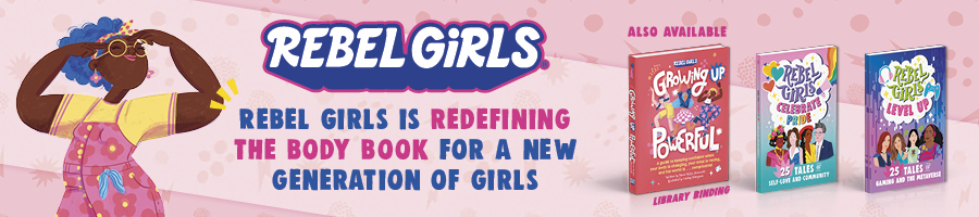
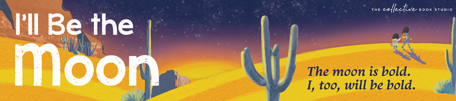
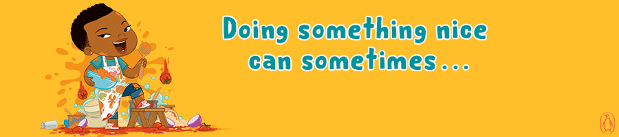
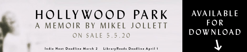
The key to a good title banner insert is having an eye-catching design. Whether you’re highlighting a review; summarizing your book; or encouraging readers to nominate for LibraryReads or IndieNext, having a design that matches the style and feeling of the title is the best way to get your title more attention. These are some favorite title banner inserts of mine, because they give a glimpse into the story with additional elements that you don’t see on the cover:
You can even use a GIF to add some excitement to your title banner insert:

How can publishers take their inserts to the next level?
One awesome way to leverage title banner inserts to your biggest advantage is to include a relevant call to action. We see great inserts that remind readers of the upcoming deadlines for the next Indie Next List or LibraryReads and encourage them to nominate the book. Title banner inserts can be linked to outside sites, if needed. Plus, since inserts can be swapped out, you can just switch the artwork once a particular deadline has passed so your banner stays fresh and relevant.
Title banners and review copies also pair very well. It is fun to use inserts to let readers know that a DRC of a title is available.
Where can publishers find out more about title banner inserts and how to add them to their titles?
You can learn more about title inserts by checking out our solutions for marketers here. You can also feel free to reach out to our marketing team at marketing@abovethetreeline.com!
Interested in learning more about advertising and promotions on Edelweiss? Find information in our Marketing and Media Kit and on our website here