


Building a Better Book World: A New Brand for Our Next Twenty Years
As Edelweiss heads into its 21st year, we are excited to unveil a new look and brand for the organization! We set aside time in 2022 to reevaluate and reimagine the Edelweiss brand, working to better capture who we are and where we are going in the future. The result is a redesigned logo and tagline, fresh brand colors for a new user experience on the site, and an updated website to take us into the next 20 years.
In honor of the launch of our new brand, Edelweiss CEO John Rubin and President Annie Rubin discuss the process of developing these elements, their inspirations for the new look, and what they hope the redesign will bring to Edelweiss and its users.
Edelweiss’s new brand and logo are the culmination of a long, collaborative process you began in 2022. Why did you decide to undertake this work when you did, and what were your goals?
Our organization turned twenty in 2022, which felt like the perfect time to reevaluate and reimagine the brand to express more about who we are today.
The Edelweiss Plus name and logo were, in retrospect, probably always temporary. Edelweiss Plus was "Plus" in reference to Edelweiss "Legacy," which was the first iteration of Edelweiss. The new version (launched in 2016) was different enough that it needed a different name at the time... kind of like Coke and Coke Classic.
We’re far enough away from that first iteration now that the meaning behind Edelweiss Plus has changed. So, moving forward, we will be using the plus to mean “Edelweiss and…”—in reference to our other products and initiatives.
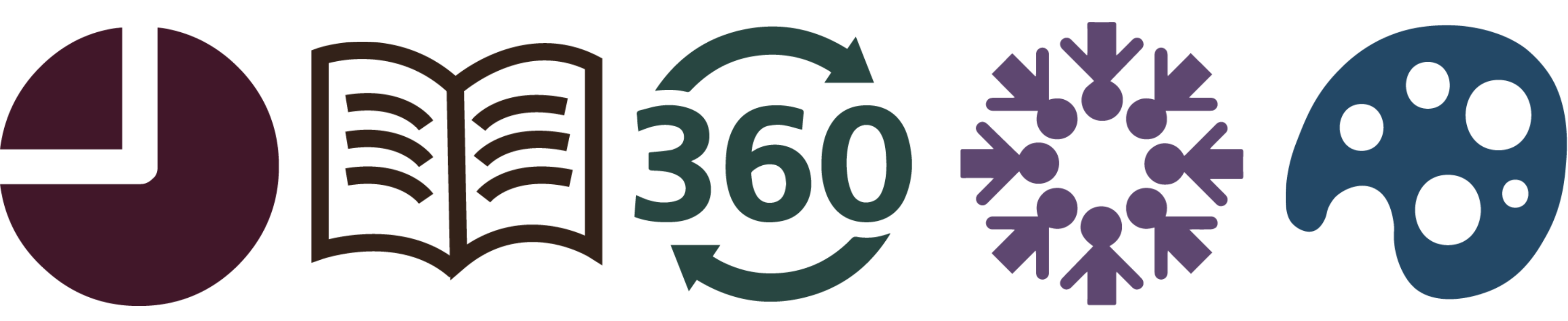
The new logos for our suite of products: Analytics, Reader, 360, Community, and Designer
And, because we’ve developed a good number of new products over the years, we wanted to do a better job of branding those with updated product logos and colors. Each of our products now has a distinct color and logo that differentiates it for the user as they navigate through the suite of tools available on Edelweiss.
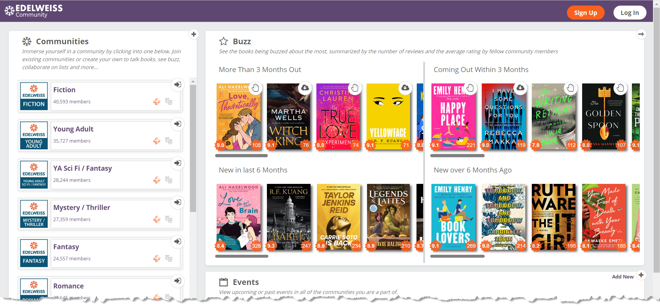
Each product's banner will change color as a user navigates through the suite of Edelweiss products
Finally, with this rebrand we wanted to address a very common confusion. In the past, we referred to ourselves as Above the Treeline but, over the last ten years, more and more people have come to know us as our main product Edelweiss. So, we've decided to adopt a more expansive use of the "Edelweiss" brand and name going forward.
What are some of the inspirations behind the new logo and brand elements developed to represent Edelweiss?
The sun rising in our new logo references “every morning you greet me,” a lyric from the song "Edelweiss" in the Sound of Music. To us, this part of the song always felt very apt for people who work in Edelweiss every day. The sun also evokes the Edelweiss flower itself.
The rising sun and book that make up our logo
The book image is obviously a nod to the industry we serve but also, with the sun rising over it, looks like a mountain range—a reference that retains the spirit of the Above the Treeline name.
In keeping with that theme, we selected the brand colors from nature images that spoke to us. The natural world and protecting the environment is important to us—and, of course, this continues the connection with Above the Treeline.
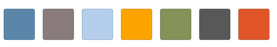
Our new brand colors, taken from nature
Our new tagline is, “Building a better book world.” How was this tagline developed, and what does it mean to you?
It was a collaborative process where we got input from across the organization. The core of what we’ve always tried to do is create and iterate on products that make life easier for our customers and user base.
We also are committed to trying to do what we can to make the world a better place—starting with ourselves, our company, the book industry and the communities with which we work . That includes dismantling systemic racism and bias and protecting the environment. It also contains a nod to one of our most important values as an organization—"Build with Heart," which is how we approach our business.
Did anything about the process of developing the new brand surprise you? Were there challenges you didn’t expect? Especially rewarding parts?
We’re very grateful to our Marketing Director and marketing team for guiding us through the process with the "Build with Heart" mentality throughout. The iteration and flexibility helped us to refine who we are and how our brand reflects that—and in that way it was very exciting.
What are some other changes coming with the rebrand that make you excited?
It’s great to have a marketing website refresh—this new site is more professional and more reflective of who we are. It will make it easier for our customers to learn more about and distinguish between our products.
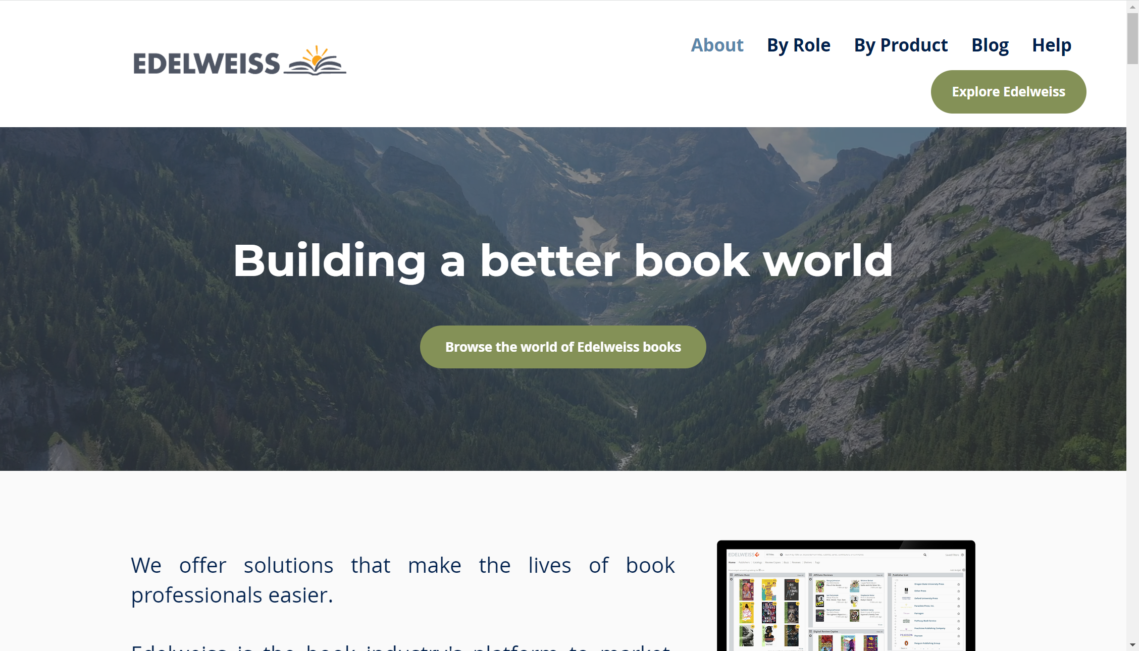
Our updated marketing website